Building enthusiasm for financial services
LendingClub is a peer-to-peer lending company based in San Francisco. Their services help borrowers consolidate debt, fund unexpected expenses, and get quick access to loans with a fast, easy-to-use interface on desktop and mobile.
The goal of this project was to optimize the first time user experience on their landing pages to increase the comprehension, curiosity, and interest of visiting prospects.
Challenge
Tailor the company's web marketing to newly discovered customer needs.
Outcome
I created improved landing page designs, written copy, and an interactive quiz tailored to LendingClub's customer demographics.
Scope Of Work
- Digital Marketing Assets
- User Experience Design
- User Interface Design
- Information Design
- Copywriting
Client
Project Lead
Keara Fallon-Mulcahy
Context
A growing financial services company
LendingClub was founded in 2006 by Renaud Laplanche, with the mission of creating “the shortest possible path between the source of capital, individual investors, and the use of capital to individual people and small businesses.”
The company operates a two-sided marketplace that connects individual lenders with potential borrowers. Borrowers apply for loans and are carefully screened by LendingClub before getting approved. Individuals invest in Notes - securities that correspond to fractions of loans - providing capital for these loans in exchange for annual interest on their principal amount.
By operating with lower fixed costs than a traditional bank, LendingClub can offer quicker disbursals and better rates for borrowers with high FICO scores.
Challenge
Optimizing for customer needs
After starting their company as a Facebook application, LendingClub transitioned into a web platform. With more access to detailed customer information, the company now had a better idea of their target user's specific needs.
The company's intent for the project was to refine their landing page experiences around their 3 primary customer needs:
Comparison
A comparison customer needs accurate cost information to pick LendingClub over the competition.
Curiosity
A curious customer needs to see a wide range of offerings to feel motivated to explore the website further.
Urgency
An urgent customer needs to understand funding timelines to make a critical financial decision.
Approach
Focusing on trust and communication
As a growing brand in financial services, prospective customers may perceive LendingClub's novel offerings as risky or unsafe for their needs. The primary goal of the new site design was to communicate clearly and build trust, creating a personal connection with visitors.
One strategy to evoke trust from unfamiliar customers is to use a principle from behavioral psychology called social proof. Here's an explanation from Farnam Street:
When we feel uncertain, we all tend to look to others for answers as to how we should behave, what we should think and what we should do. This psychological concept is known as social proof. It occurs as a result of our natural desire to behave in the correct manner and fit in with others.
Product
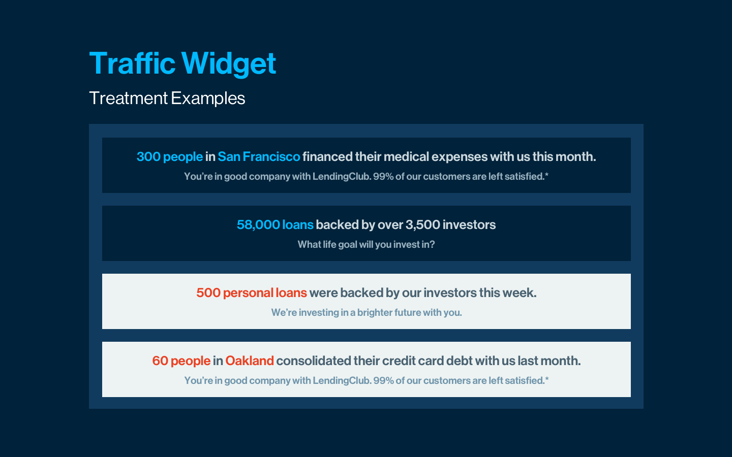
Personalized success stories with data
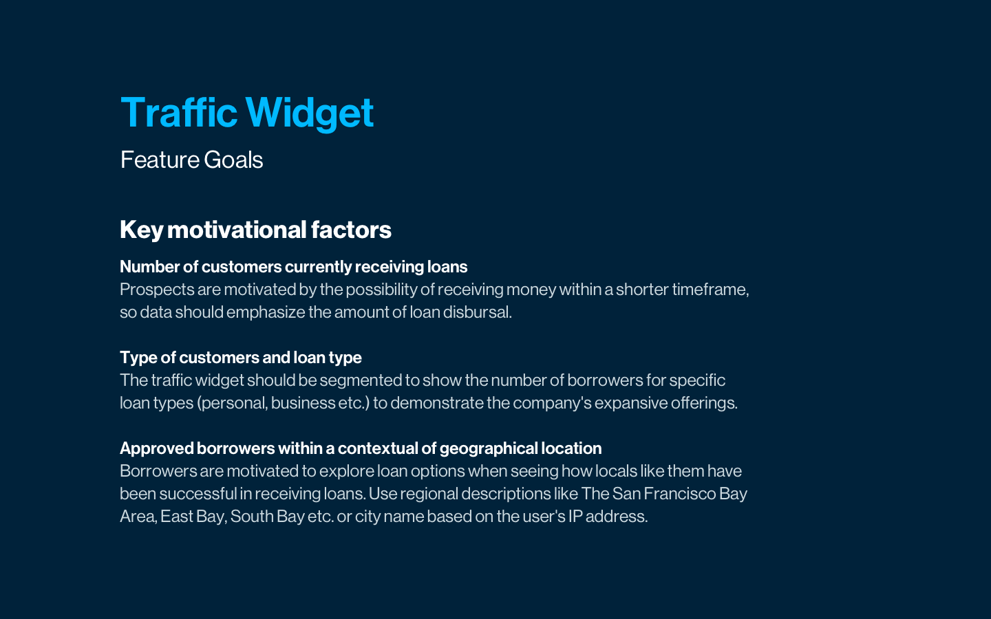
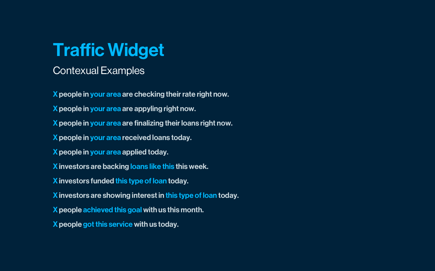
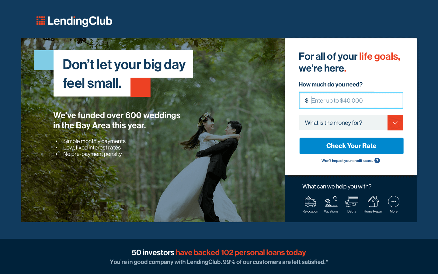
When a new visitor sees relevant examples of customer success from others like them, it increases their likelihood of converting into a customer. I developed visual treatments and documentation for a new feature that shows customer success statistics using personal context from the visitor's current page and location.
Layout
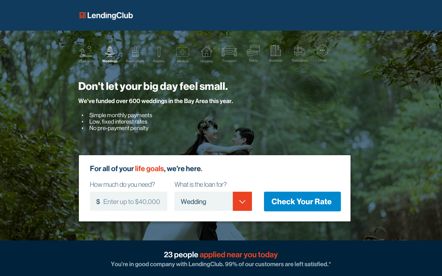
Highlighting a breadth of use cases
I planned to create an appeal for the curious customer by showcasing the company's variety of offerings. In the process, I spent weeks working on multiple layouts and visual comps that would also incorporate the new traffic widget.
One of the options to showcase variety was by having a long row of translucent icons on a full-bleed background, bringing the focus on the image and selected offering. However, concerns around legibility made us choose a simple layout that subtly hinted at a few other use cases.

Interaction
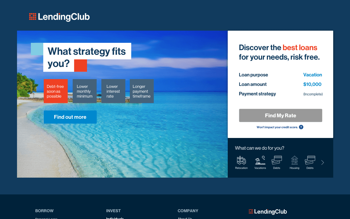
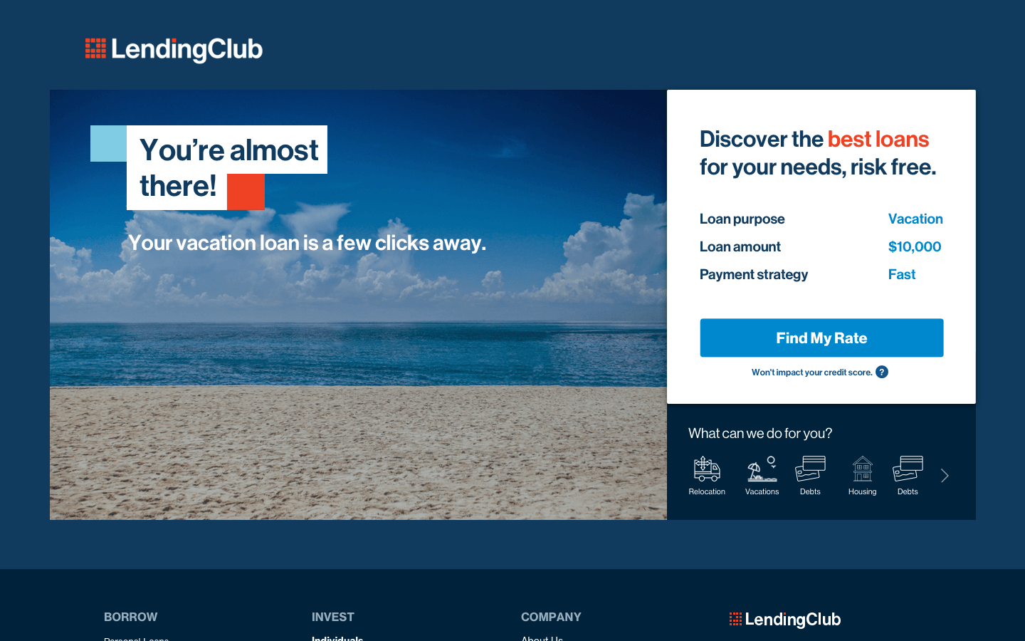
Qualifying leads with a quiz
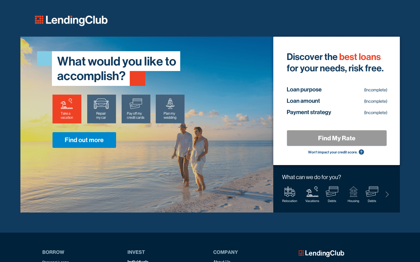
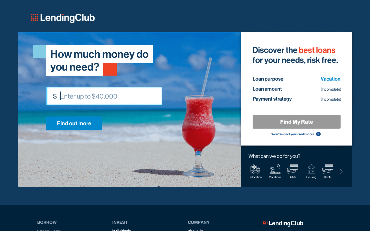
Comparison customers have a higher awareness of their individual financial needs. In this case, it's more important for a landing page experience to focus on their specific situation, instead of showcasing a variety of options.
I developed the visual layout and flow for a 4 step quiz that would help a comparison customer understand the potential benefits available for them. This quiz would also serve as a way to pre-fill their application if they choose to apply for a loan.

Marketing
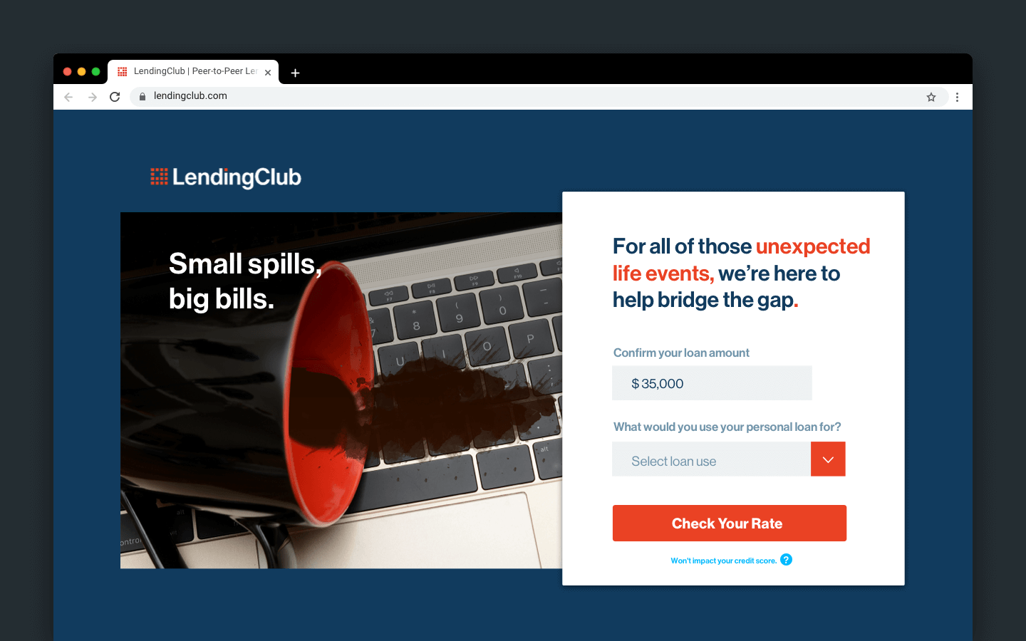
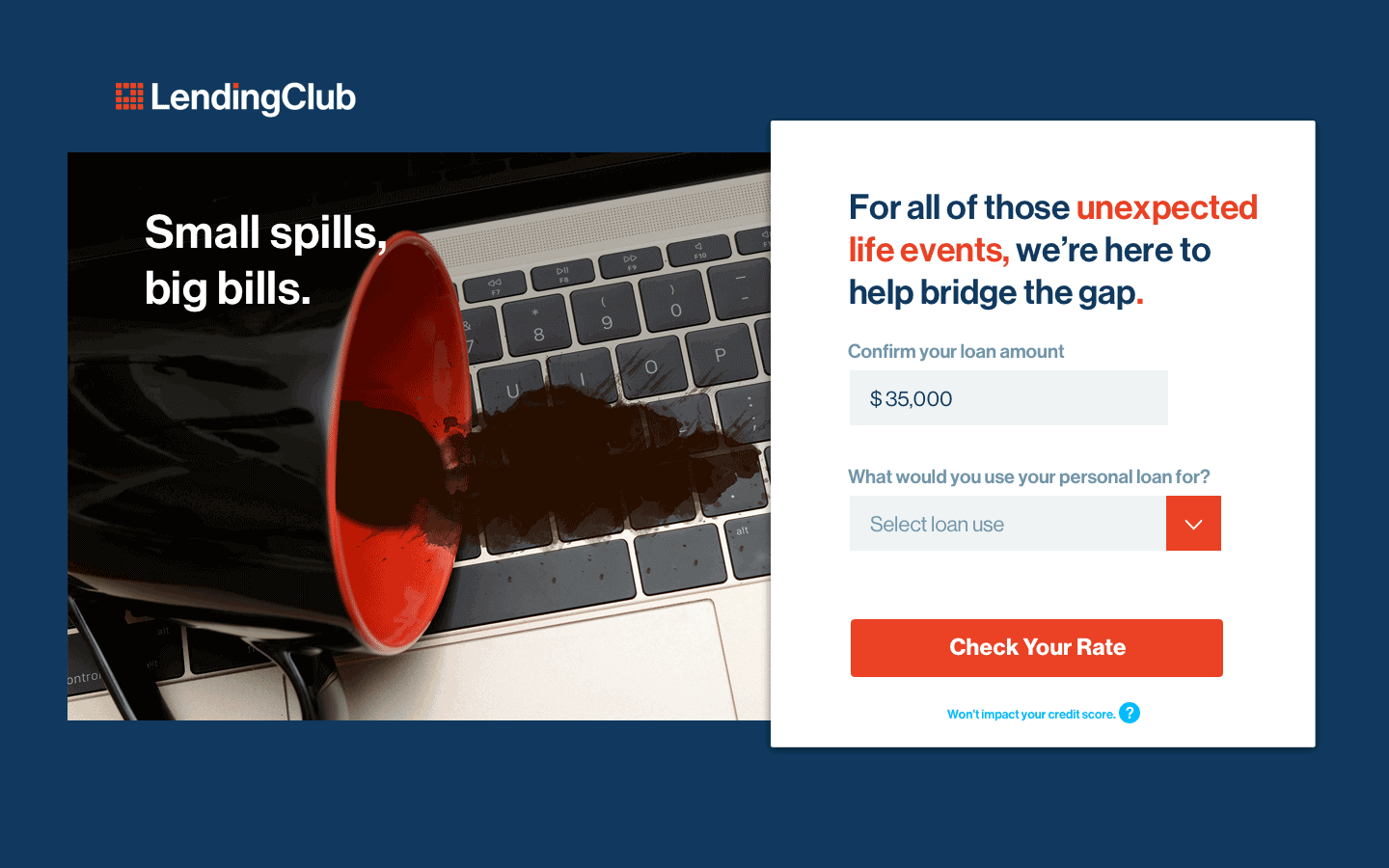
Highlighting technical difficulties
For the tech workers of San Francisco (where most of LendingClub's customers are based), laptops are like lifeblood. Having beverages spill on your machine is a surprisingly common problem, and repairing or replacing a high-end computer can cost hundreds or thousands of dollars.
After working on updated copy and layouts for LendingClub's existing marketing, I proposed and developed an original campaign for tech-related emergencies. This campaign would also appeal to a broader segment of customers with urgent needs.
Results
An improved browsing and sign-up experience
We deployed the new designs on the website for A/B testing. Initial results showed that the new landing page experiences had better performance with prospects than existing marketing campaigns. The emergency campaign and traffic widget layout increased time-on-site by 30%, and the quiz increased new applications by 12%.